Kickstarting Your Web Design Project: The Essential Checklist
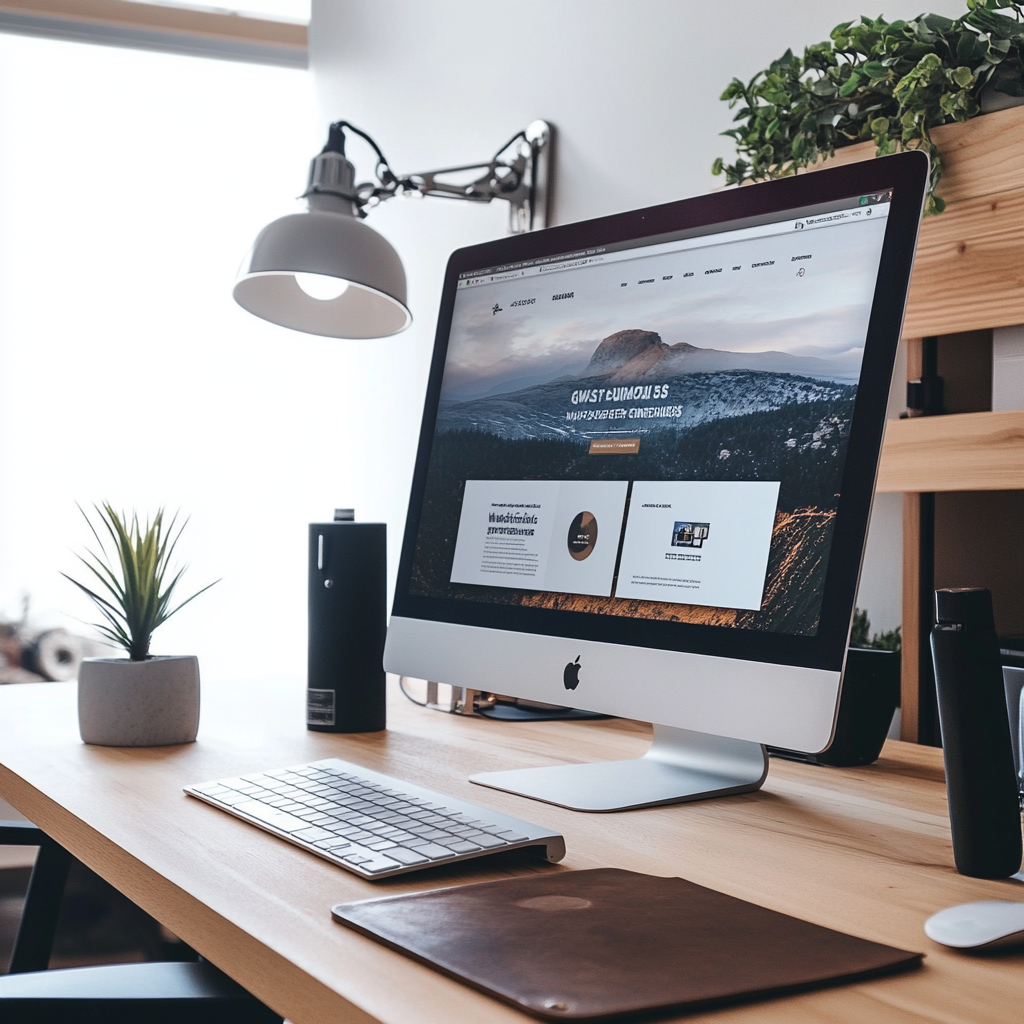
Think of your website as your online business card, an indispensable marketing instrument, and the first handshake with potential customers. Feeling lost in the wilderness of website creation? Fret not! This blog post is your compass, providing a thorough checklist to ignite your web design project.
What is Web Design and How is it Different from Web Development?
Web design and web development are two key elements in creating a website. Although they both contribute to building a website, their roles and skills are quite different.
Web design is about creating the look and feel of the website. It's like being an architect for a house—it involves designing the layout, choosing the colors, and deciding where everything goes. The main goal of a web designer is to make the website visually pleasing and easy to use.
On the other hand, web development is about turning the designs into a live, functioning website. It's like being the builder for the house—taking the architect's plans and physically constructing the house.
To give you a clearer picture, here are some differences between the two:
- Role: Web designers create the visual aspect of the website, while web developers make those visuals function as a real, live website.
- Skills: Web designers need good aesthetic sense, an understanding of color combinations, and knowledge of how to arrange information so it's easy to understand. Web developers need problem-solving skills to make sure the website works well.
- Focus: A web designer focuses on the user's experience, making sure the website is attractive and easy to navigate. A web developer's focus is on making sure all the parts of the website work together smoothly.

- Tools: Web designers use tools that help them create the visual look of the website. Web developers use tools that help them build the functional parts of the site.
Even though web design and web development are different, they work together to create a complete, working website. Understanding the difference between the two helps you appreciate what goes into creating a website from start to finish.
Why is Responsive Web Design Important?
Responsive web design is a design approach that ensures a website's layout, images, and functionalities adjust smoothly to fit different screen sizes. This means that whether a user is accessing a site from a desktop computer, a tablet, or a smartphone, the website will automatically reformat to provide the user with the best viewing experience.
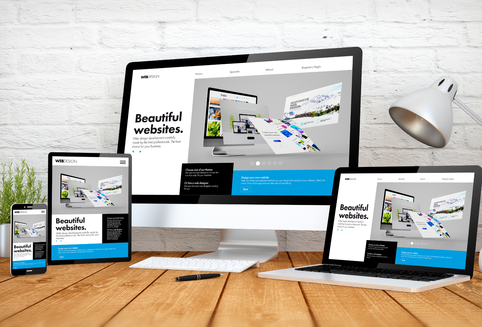
The main goal of responsive design is to avoid unnecessary scrolling, zooming, or panning that often happens when sites are not optimized for different devices. Instead, a responsive website automatically adjusts to the screen size of the device to ensure the website is easy to use and navigate, regardless of how you're viewing it.
For instance, on a mobile device, a responsive website might show content in a single-column view, whereas the same content would be shown in two columns on a desktop computer. Images also resize and buttons become larger to accommodate easier interaction on touch screens.
In essence, responsive web design is about providing the optimal user experience irrespective of whether they use a desktop computer, a smartphone, a tablet, or even a smart TV.
How to Define the Scope of Your Web Design Project?
Before you begin any web design project, it's crucial to establish a clear and comprehensive project scope. This process involves defining your website's objectives, understanding who your target audience is, and setting both your timeline and budget. By doing these upfront, you can set realistic expectations for your project, prioritize the necessary features, and avoid potential oversights or delays.
Here's a checklist that can guide you through the process of defining the scope of your web design project:
- Project Objectives: Identify what you want your website to achieve. Are you looking to generate leads, sell products, provide information, or something else?
- Target Audience: Understand who your users are. What are their preferences, needs, and online behaviors? This will influence the design and functionality of your website.
- Website Features and Functionality: List down all the features that your website needs to have. This could be anything from a blog section, an e-commerce platform, or a contact form, among others.
- Timeline: Determine the timeframe for your project. Remember to include ample time for each stage of the process - planning, designing, developing, testing, and launching.
- Budget: Establishing a clear budget for your project is crucial, covering costs from design and development to maintenance. Costs can vary significantly, with simple websites ranging from $2,000 to $15,000, and more complex sites costing from $30,000 to $80,000. Remember to also account for potential additional costs such as SEO services, content creation, and digital marketing strategies.
- Content Creation: Plan out the content that will go on your site. This includes text, images, videos, etc.
- Search Engine Optimization (SEO): Consider how you'll optimize your site to rank well on search engines. This might affect your site structure, content, and even design.
- Design Aesthetics: Think about the overall look and feel of your website. It should align with your brand identity and appeal to your target audience.
- Maintenance Plan: Websites require regular updates and maintenance. Determine who will handle these tasks and how they will be managed.
- Prioritization: Depending on your timeline and budget, you may need to prioritize certain features or tasks. Identify what's most important and tackle those first.
By following this checklist, you can create a comprehensive project scope that sets the stage for a successful web design project. This ensures that all vital aspects are considered and nothing significant is left out.
Which CMS Should You Choose for Your Website?
A Content Management System (CMS) is a software application that helps you create, edit, and manage your website's content without needing to code. Your choice of CMS should align with the specific needs of your website and your technical skills. When choosing a CMS, consider factors like its ease of use, flexibility, security features, and the level of support available. It's always best to choose a CMS that suits your individual requirements and comfort level.
How to Prepare Your Content for Your Website?
Preparing your website's content involves more than just writing text. It's about creating a cohesive, engaging experience for your visitors that communicates your brand message effectively. Here are different types of content you can include in your site:
- Text: This includes your About page, product/service descriptions, blog posts, FAQs, and any other written content. Make sure it is clear, concise, and aligned with your brand voice.
- Images: High-quality images enhance the visual appeal of your site and support your content. This could be product photos, team photos, or relevant stock images.
- Videos: Videos can increase engagement on your site. They could be product demos, customer testimonials, or informative videos about your services.
- Infographics: These are great for explaining complex information in a visually appealing and easy-to-understand way.
- Podcasts: If your brand has a podcast, embedding episodes on your site can add value and keep visitors on your site longer.

- Case Studies or Whitepapers: If you're a B2B company, these detailed pieces can showcase your expertise and success stories.
- Interactive Content: This could be quizzes, calculators, or interactive infographics that engage users and encourage them to interact with your site.
If you don't have the resources to create all this content yourself, there are several places where you can purchase high-quality stock content:
- For Images: Websites like Shutterstock, Adobe Stock, and Unsplash offer a vast collection of stock images.
- For Videos: Sites like Videoblocks and Pond5 offer royalty-free video footage and animations.
- For Infographics: You can use platforms like Canva or Piktochart to create your own infographics using their templates.
Remember, the goal of your content should always be to provide value to your visitors, answer their questions, and guide them toward making a purchase or getting in contact with you.
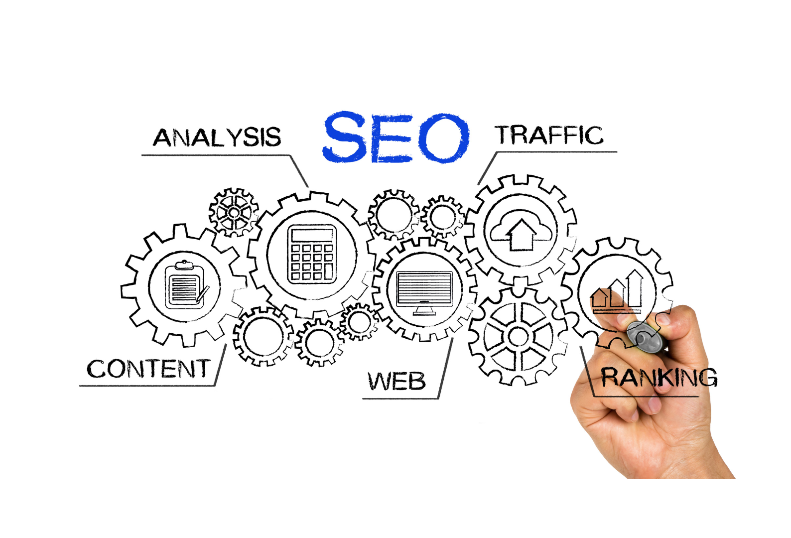
What Role Does SEO Play in Web Design?
Search Engine Optimization (SEO) isn't just a component of web design—it's a critical necessity. It's the deciding factor that can set your website apart from millions of others on the internet, making it visible to your target audience.
A well-optimized website has the potential to rank higher on search engine results pages (SERPs), which directly translates into more traffic to your site. Without effective SEO, even the most aesthetically pleasing or user-friendly website might remain obscured, buried under countless other search results.
Incorporating SEO best practices into your web design process is non-negotiable. This includes using relevant keywords in your content and meta tags, optimizing images for faster load times and including alt text, and ensuring your site loads quickly across all devices.
Remember, SEO is not a one-time task, but an ongoing endeavor. As search engine algorithms continue to evolve, staying updated with the latest SEO techniques is crucial to maintaining your website's visibility and ranking. In short, SEO doesn’t just support your web design—it’s the lifeline that ensures your website can be found amidst the vast digital landscape.
How to Ensure Website Accessibility?
Web accessibility is a crucial aspect of web design that ensures your website is usable by everyone, including people with disabilities. By making your website accessible, you are catering to a broader audience, which can ultimately increase your reach and potential customer base.
In addition, accessible websites often rank better in search engine results. Search engines like Google consider accessibility as a ranking factor, meaning that adhering to accessibility guidelines can improve your SEO.
Here are some ways to make your site accessible:
- Keyboard-Friendly Site: Ensure your site can be navigated using only the keyboard. This is essential for people who cannot use a mouse or trackpad.
- Use Alt Text for Images: Alt text describes an image and is used by screen readers for visually impaired users. It also helps with SEO as search engines crawl this text.
- Choose Easy-to-View Colors and Fonts: Use high contrast colors for text and background, and choose fonts that are easy to read. Avoid using small font sizes.
Beyond these basic practices, there are third-party widgets you can include on your site to enhance accessibility and maintain ADA (Americans with Disabilities Act) compliance. These widgets can add features like a text-to-speech function, font size adjustment, and more. Here are a few options:
- UserWay: This widget provides helpful accessibility options like keyboard navigation, text spacing, and contrast adjustment.
- AccessiBe: This AI-powered solution offers comprehensive web accessibility tools, including screen reader and keyboard navigation enhancements.
- WP Accessibility Helper: If your website is built on WordPress, this plugin offers a suite of tools to improve your site's accessibility.
Remember, web accessibility isn't just about compliance—it's about ensuring your website can be enjoyed by all users, which can ultimately lead to a larger audience and more business for you.
Conclusion
In conclusion, weaving together high-quality content, solid SEO practices, and robust accessibility features is not just a winning formula for your website—it's an essential strategy for standing out in the digital age. As you create a website that speaks clearly through its text, delights visually with images and videos, informs with infographics, and engages with interactive elements, remember that SEO and accessibility are the twin pillars that will elevate your user experience and expand your reach. By committing to these principles, you set your site apart as a beacon of inclusivity and relevance in an ever-competitive online world. Hence, don't just build a website; craft a digital destination that echoes your brand's excellence and welcomes every visitor with open arms.
About The Business Theory
Ready to elevate your online presence with a leading website design company in Miami, FL? Look no further than The Business Theory. We're not just another design firm; we're where award-winning designs meet cutting-edge digital marketing. Our team of experts specializes in crafting distinctive online presences that set you apart in the crowded digital landscape of Miami. We go beyond aesthetics, creating captivating websites that convert visitors into customers. Whether you're a local startup or an established business looking to revamp your online presence, we're equipped to help you make your mark. So, don't wait—contact us today, and let’s start crafting a website that stands out and delivers results.